Together with our rebrand, we’ve updated our portal. It’s got a lighter look and a few new functionalities for a better user experience. Learn what’s new.
The looks
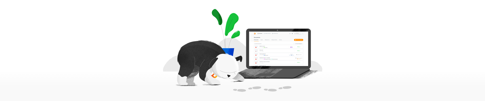
As we’ve introduced our new brand identity with the new name and colour scheme, our portal has also received a refreshed look.
Just as in our web, in the portal you will also notice the lighter colours. For starters, the header has been changed from dark grey to very light grey, and all the blue buttons and signs have been replaced with the orange ones.
Functionalities
For better user navigation, we’ve also added a few new functionalities. The main changes are visible just as you enter the portal.
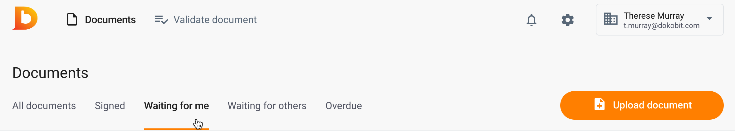
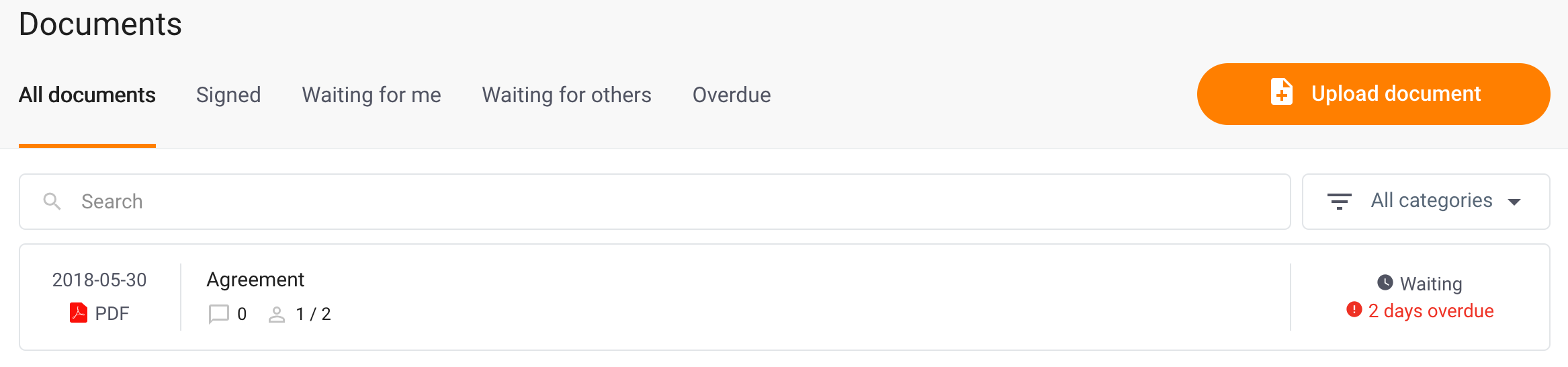
Sorting documents based on their status. At the top, next to All documents button you can now see additional buttons for more convenient browsing experience. From now on you can easily sort your documents not only according to the categories but to their status as well. There are now 4 additional sorting options: signed documents, documents waiting for your signature, documents waiting for others signature and those with the overdue signing deadline.
Changed location of categories filter. Document categories button is now placed next to search button, on the right side of your computer screen, just below the light grey header. Also, good news for free users — they get to use document categories as well! All you need to do is go to your account settings and click on Document categories tab to create your first document category.
Easier used account visibility. In case you have a few Dokobit accounts, you will now be able to easily see which account you are using. At the top, on the right side, under your name, you will see your email address. This way you won’t need to click drop-down menu anymore to see your current account.
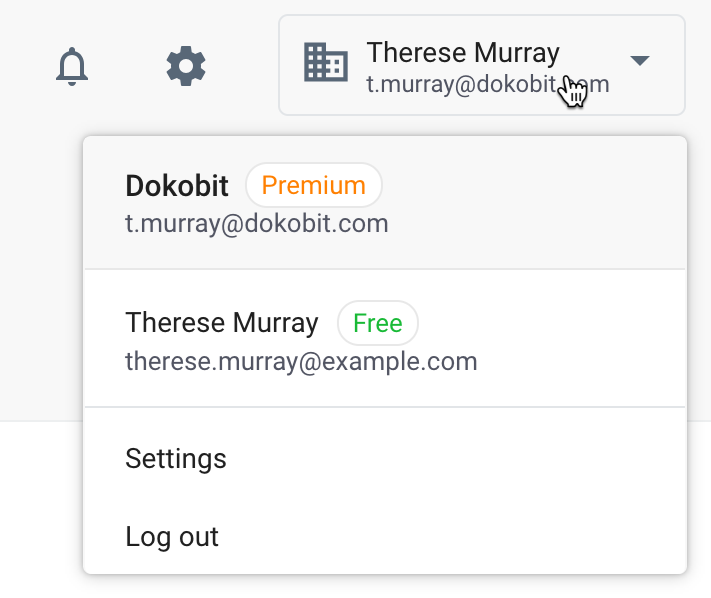
Easier settings access. Settings button has also been added next to your name and email address. This way you no longer need to click drop-down on your name if you want to access your account settings.

Brighter notifications. Notifications button has been improved as well. Now, if you get a notification, you will see a red notification bell instead of the blue one at the top. It’s more visible (and more usual 🙂 )
We hope that you like these changes as we believe they make portal’s user experience even simpler as it was before. Enjoy!