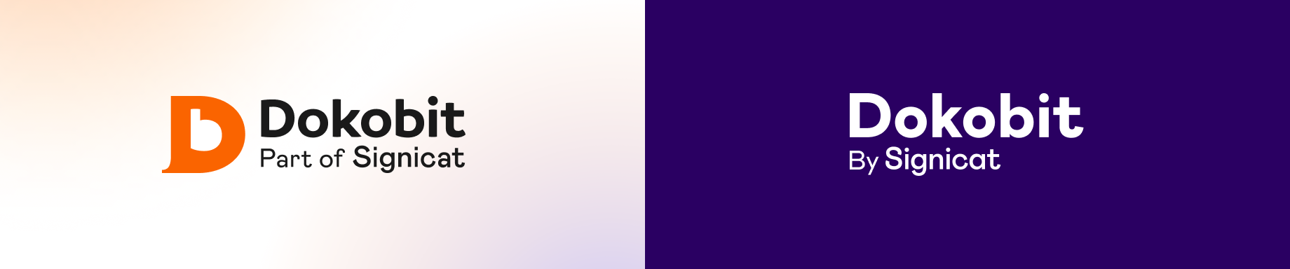
| We are happy to announce the launch of our brand uplift – the logo upgrade and refreshed colours, as part of the ongoing integration into the Signicat brand. |
| By becoming a part of Signicat, the leading identity solutions provider in Europe, in 2021, we’ve expanded the range of our cross-border e-document signing operations and eIDAS services, aiming to achieve a market leader position in the entire Europe. As a result, our goal is to strengthen our growth by unifying the brands and helping our users and customers identify with the consolidated brand all over Europe. |
What’s changed?
The consolidated brand identity supports our company-wide ambition to be the leading provider of trusted digital identity services across Europe. Though our mission remains the same, this brand renewal reinforces our objectives.
Logo upgrade
Our logo was simplified and now contains text only, representing Dokobit as a product brought to you by Signicat.
In some places, however – like in favicons or social media, where the full logo is too big – you’ll see only a logo mark which is an outline of the original Signicat logo. It consists of two shapes, the circle and the square connecting, and reflects the connection between humans (circle) and technology (square), the trusted connection.
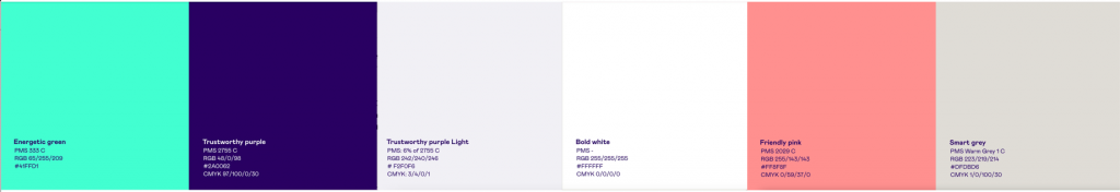
Colour change
The new colours are inherited from the Signicat brand. They convey trustworthiness, friendliness, and smartness with an energetic and bold attitude.
Primary brand colours are green, white, purple, and light purple. They are used to provide consistency throughout all brand communications. When people see our colour palette, we want them to think about Signicat. We call them Energetic Green, Trustworthy Purple, Trustworthy Purple Light, and Bold White to convey trustworthiness, energy, and boldness.
The secondary colours are called Friendly Pink and Smart Grey and reflect friendliness and smartness as indicated in their names. Friendly Pink helps to bring things alive, whereas Smart Grey helps to provide important information clearly and understandably.
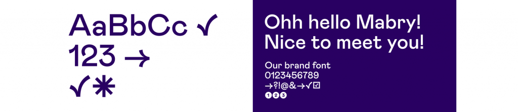
Font
Our brand typeface is Mabry, a grotesque font with a geometric but human touch by Colophon Foundry.
With an updated visual identity, we’re the same great people with the same great service. So rest assured that this brand uplift will not affect the service and commitment that our business has demonstrated thus far!